HAIKU INTERPERATIVE SEQUENCE
An Old Silent Pond is typographic and visual sequence that takes form in an eight page booklet. This sequence is based off of the haiku written by Matsuo Basho, where he explains his idea of the subconscious mind by using the frog character and pond setting as metaphors.
This booklet focuses on the haiku in which chaos returning back to silence is compared to a frog disrupting a pond's silence but never permanently. Building off from this idea, I wanted to create an overall simple harmony of different elements such as color, shape, and space leading up to climactic jumble of chaos. This booklet consists of a front and back cover along with three spreads. each individual spread contains one line from the Haiku.
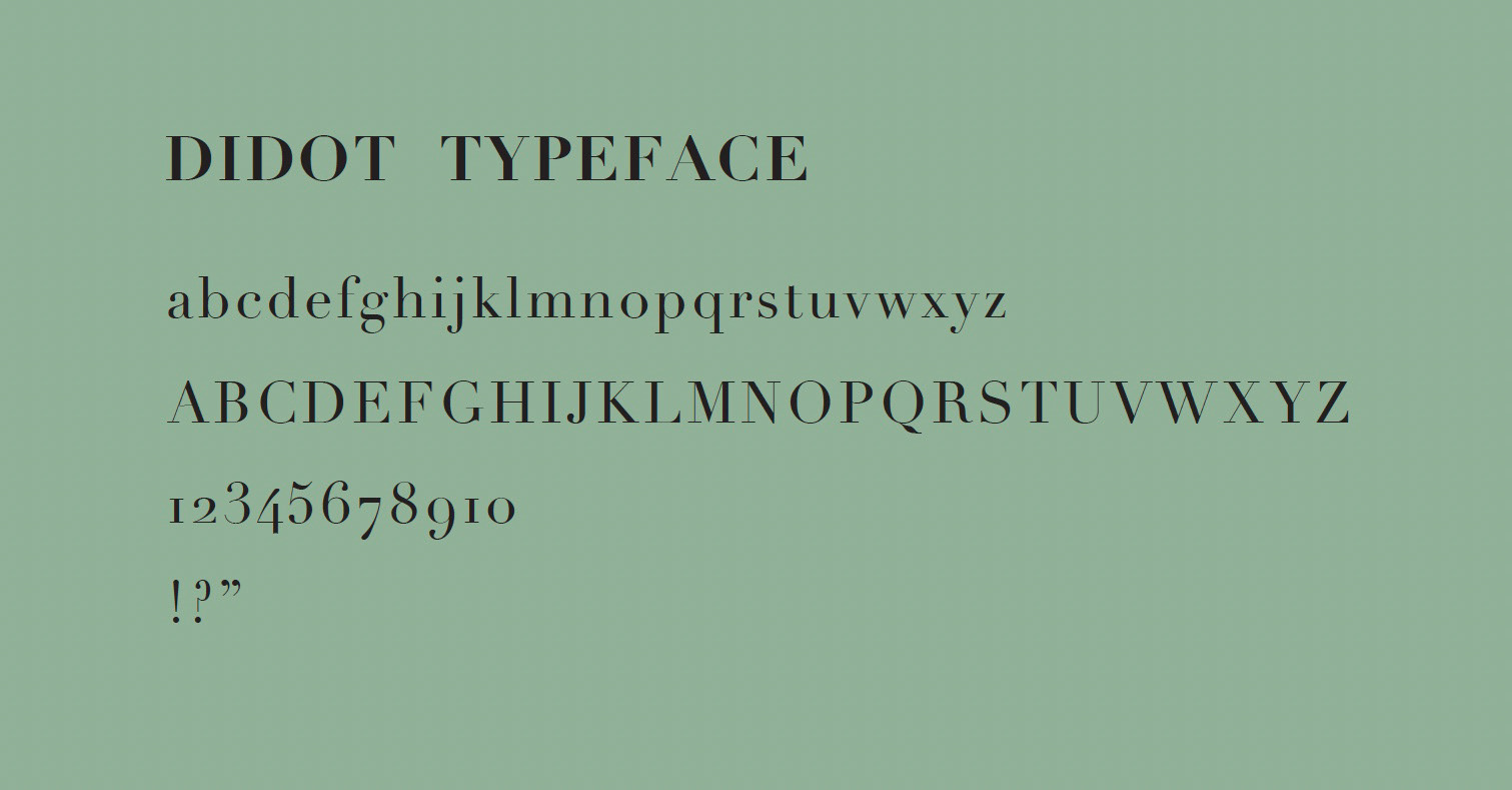
CHOOSING A TYPEFACE
I selected Didot as the typeface used throughout this booklet because of its minimalistic look. It's clear form and fine strokes allow for easy legibility and a sort of calmness across all pages within the booklet. This look furthermore helps viewers understand the context of the displayed haiku.
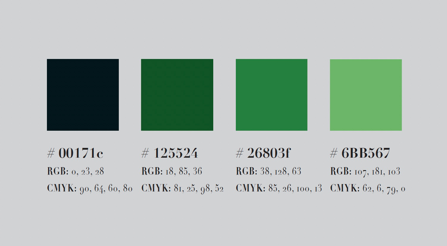
COLOR PALETTE EXPLORATION
While selecting the colors that would be used in the booklet, I wanted to hint back to the frog referenced in the haiku. I ended up choosing a more light leafy-green to achieve this. Going off from this initial selection, I based the rest of my color choices off of the green by using different hues. This color palette also emphasizes the outside setting of the haiku and furthermore helps viewers comprehend the context within.
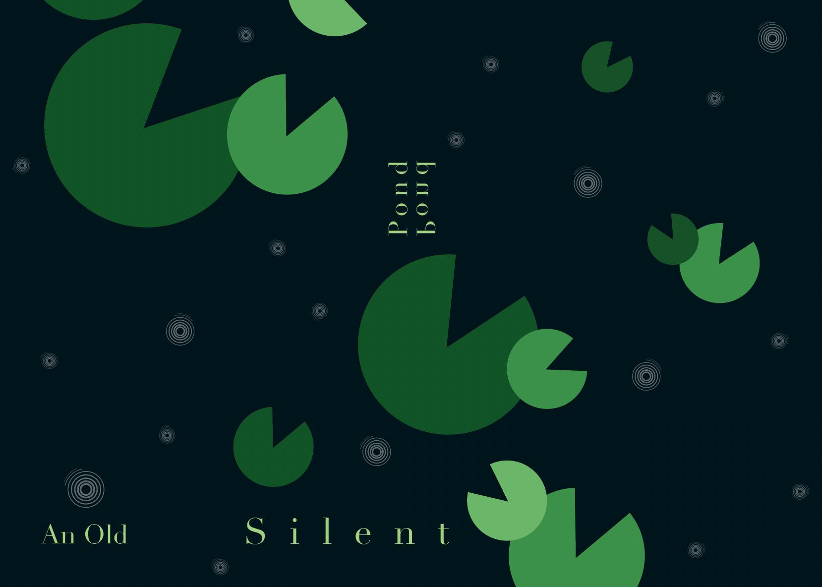
SPREAD 1
Viewing the opening spread, you can see that it focuses around the title and first line of the haiku. I started to play around with the tracking and positioning of the type to allude towards a more tranquil and serene environment. I made sure to add focus to the type by creating contrast with saturation. It was really important to me to make sure shape and intensity water riples were kept to a minimum in order to accentuate the silence present.
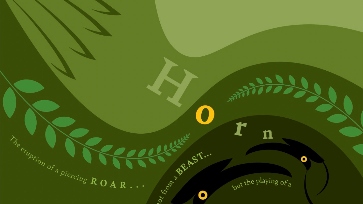
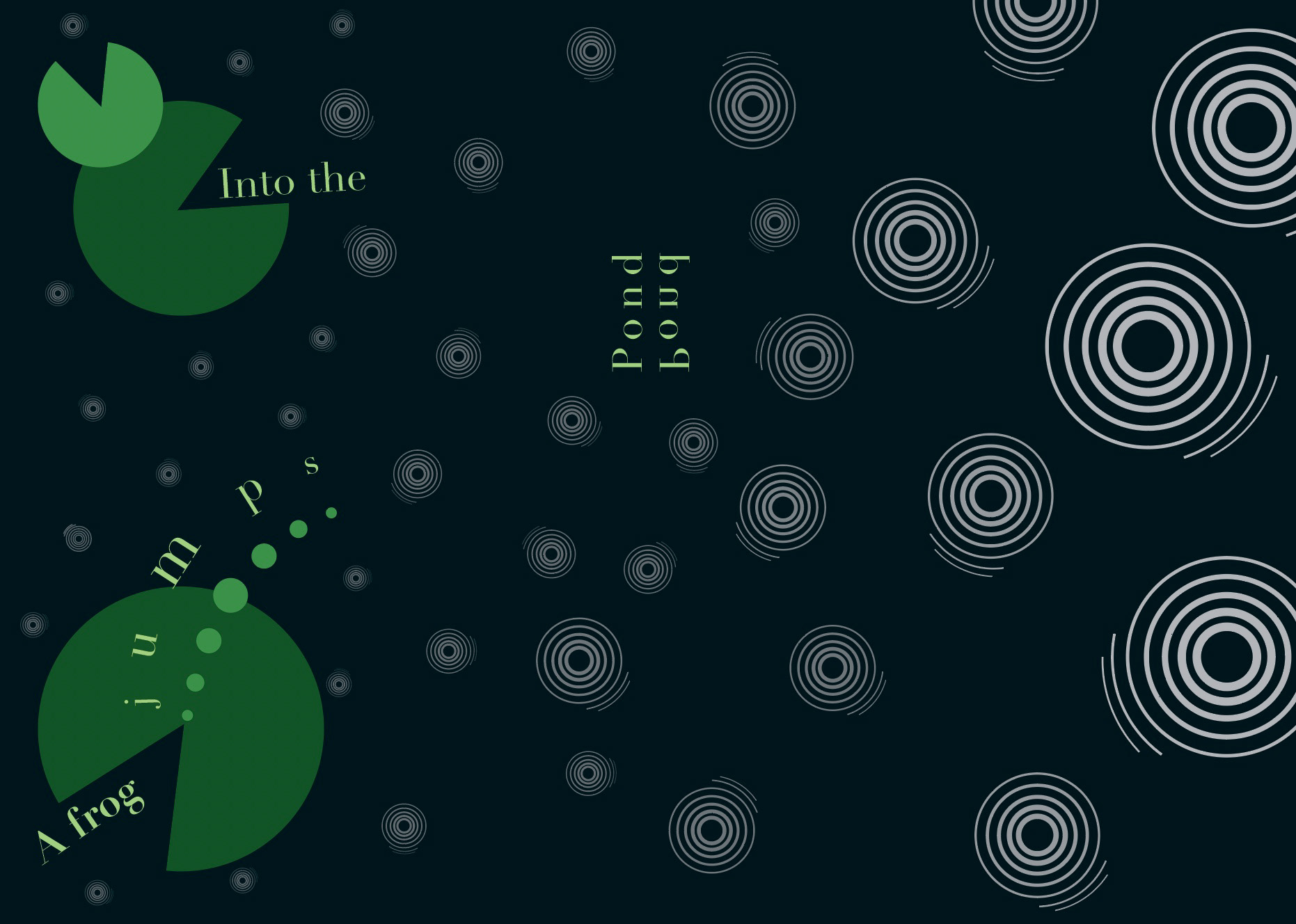
SPREAD 2
In the next spread, the second line of the haiku is revealed and the frog character is finally introduced. This frog is represented by a highly saturated leafy-green elipse arc sequence. I Intentionally incorporated this arc shape along with bolder water ripples to show movement and somewhat of a shift along the spread. The frog's movement alone gives an idea that it will be the reason for the sudden shift.
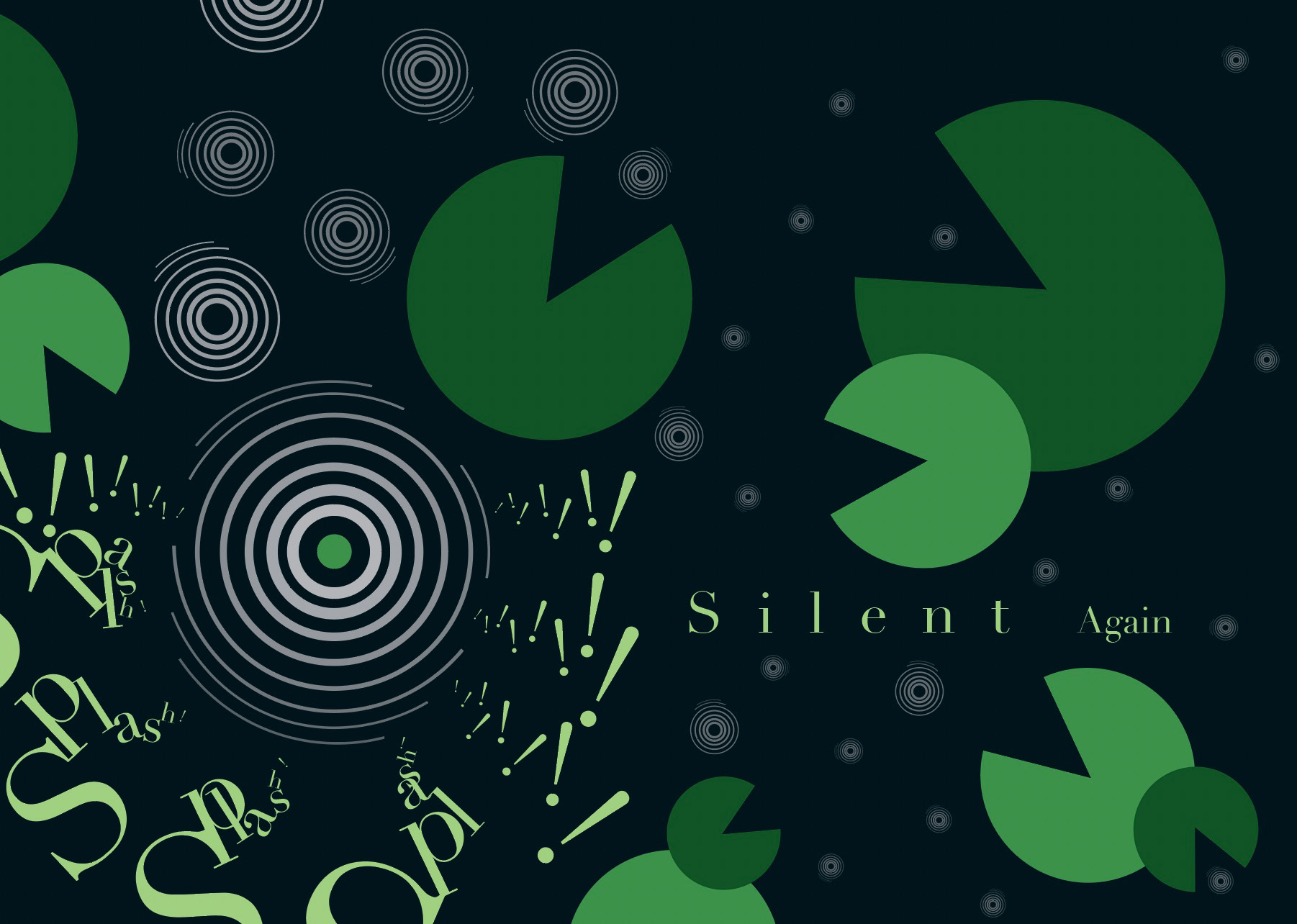
SPREAD 3
In the final spread, the last line of the haiku is introduced. The visible shift from the last spread reaches a dramatic climax in this current one. The frog, represented by the saturated leafy-green arc, is seen causing this disruption and the silence there once was is gone. The silence is not gone for long though. As the eye moves across the spread, water ripples begin to shrink and fade, the frog disappears below the water surface, and lily pads go down in number. The chaos of the disruption seems to return back to the tranquil environment it once was.
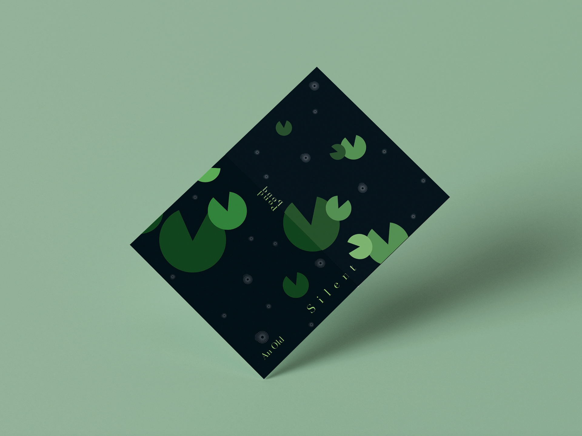
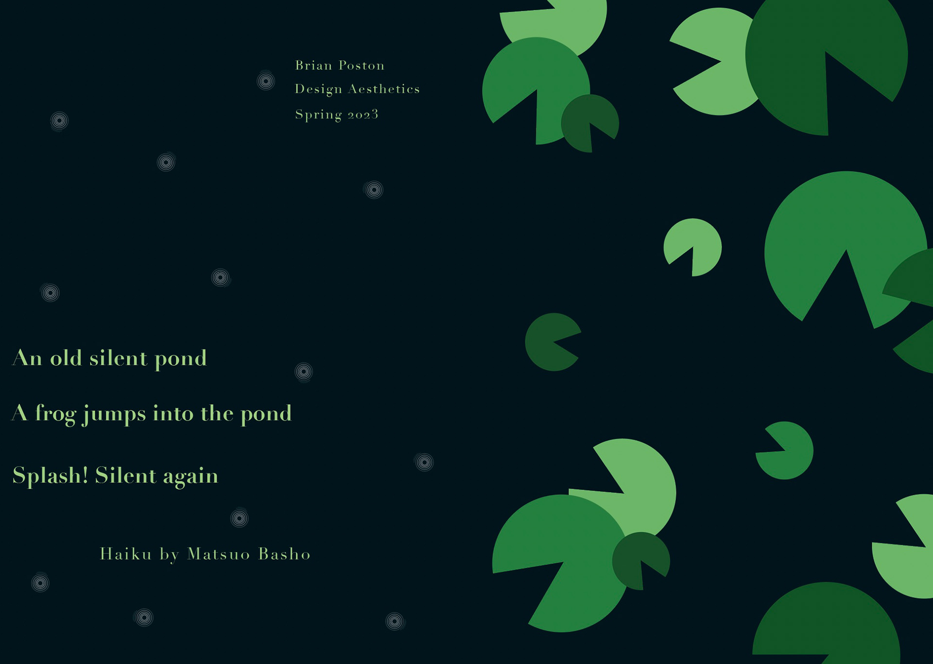
FRONT + BACK COVER
The front cover (right) centers around the natural environment in which the haiku takes place in. My goal was to keep the initial look simple yet easy to understand. I believe not including type and just a simple color palette and shape was enough to give viewers an understanding of the haiku. The back cover(left) presents the haiku in its entirety and focuses on the dainty faded water ripples that create a sense of calmness
FINAL HAIKU BOOKLET