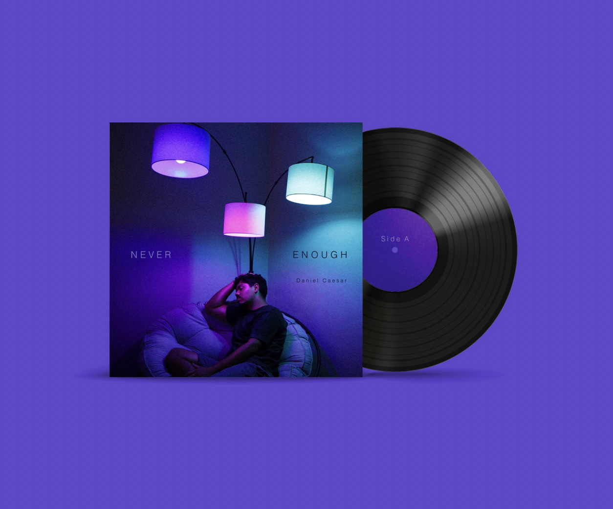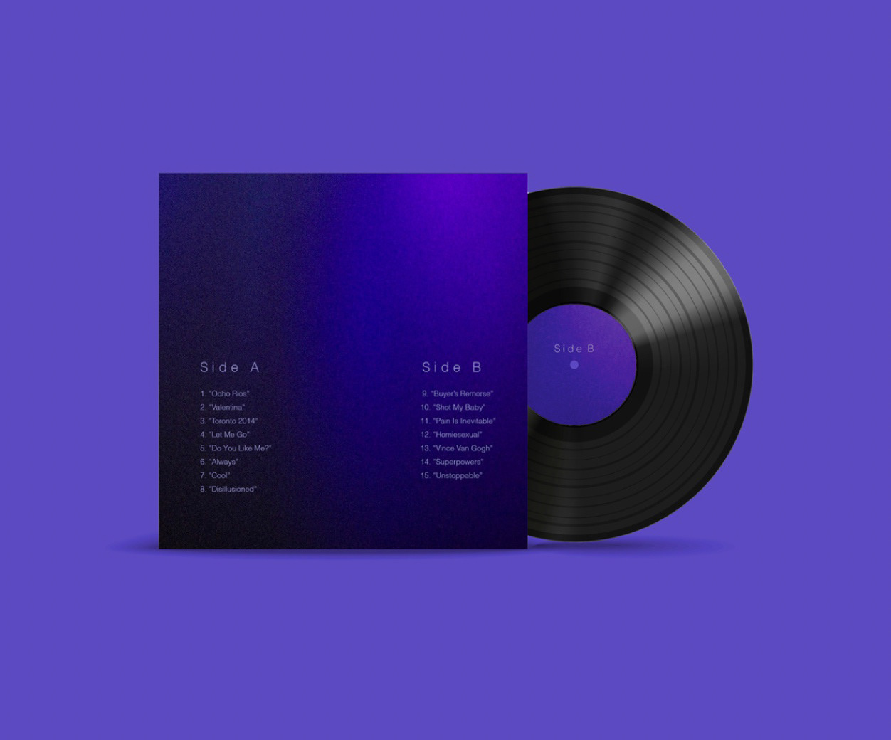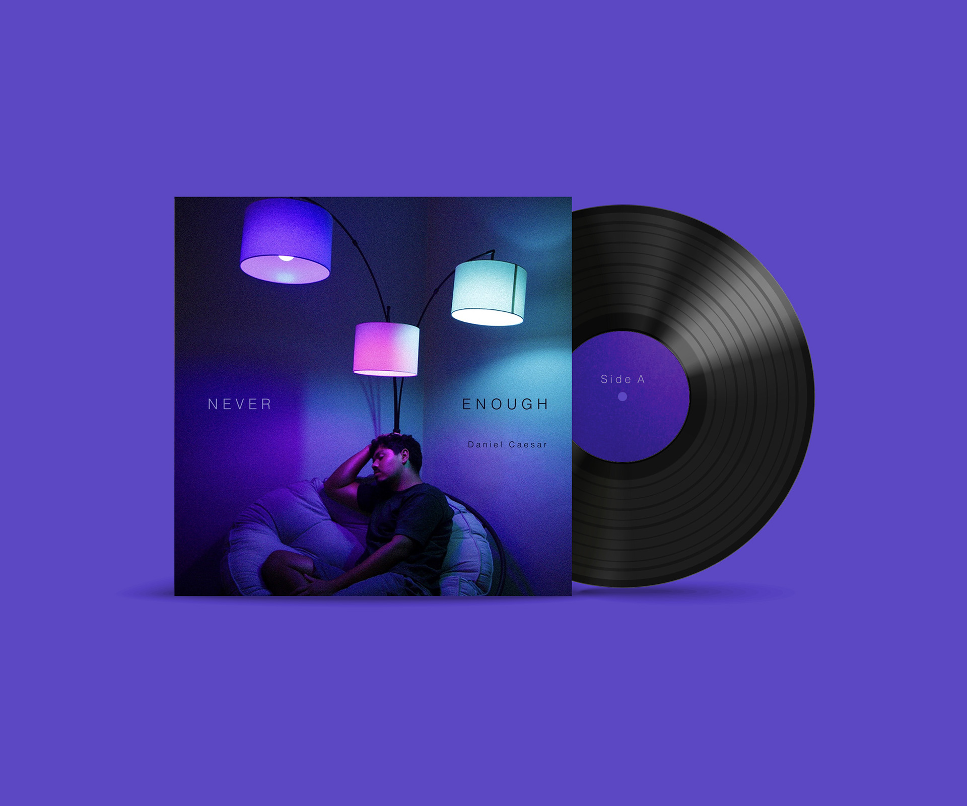

LP REDESIGN + CONTEXT
I was given the task to reimagine and design my own version of Daniel Caesar's "Never Enough" Album. I wanted to create a design that visualized the music of the original artist with photography and type. Different components I tried to keep into consideration included a front cover, back cover, spine, record sticker labels, and other crafting elements used to build the physical product.
MOOD BOARD + INSPIRATION
When I had chosen the LP I would redesign, I tried to gather images that emulated the rich, deep, and high contrast color palette of the original design. Some of the other components that I really wanted to keep into consideration were minimalism and mood.
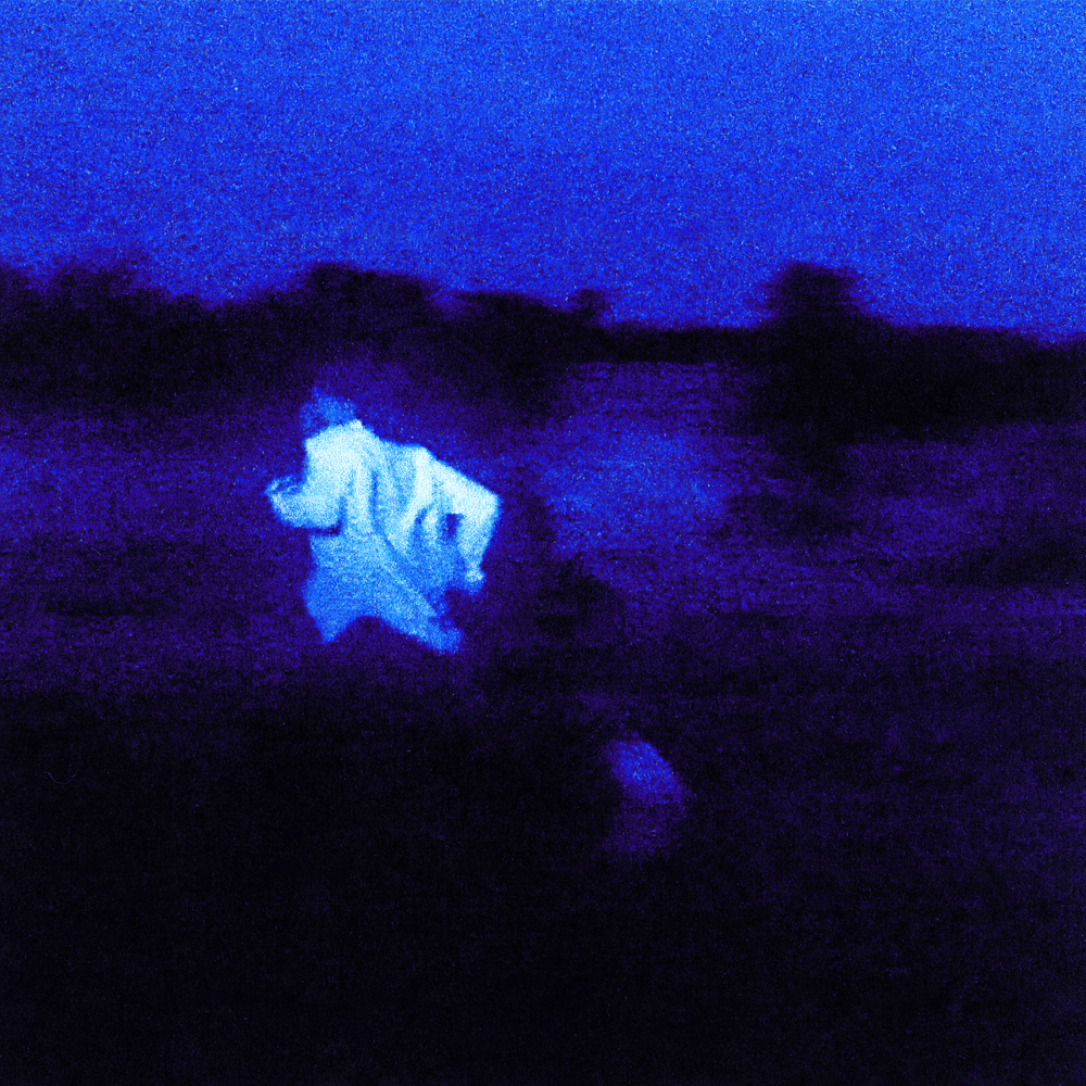
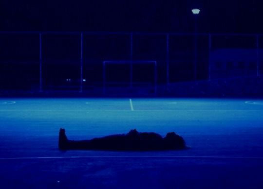
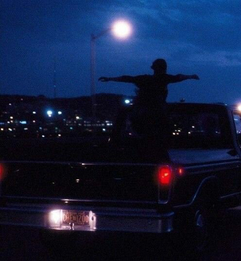

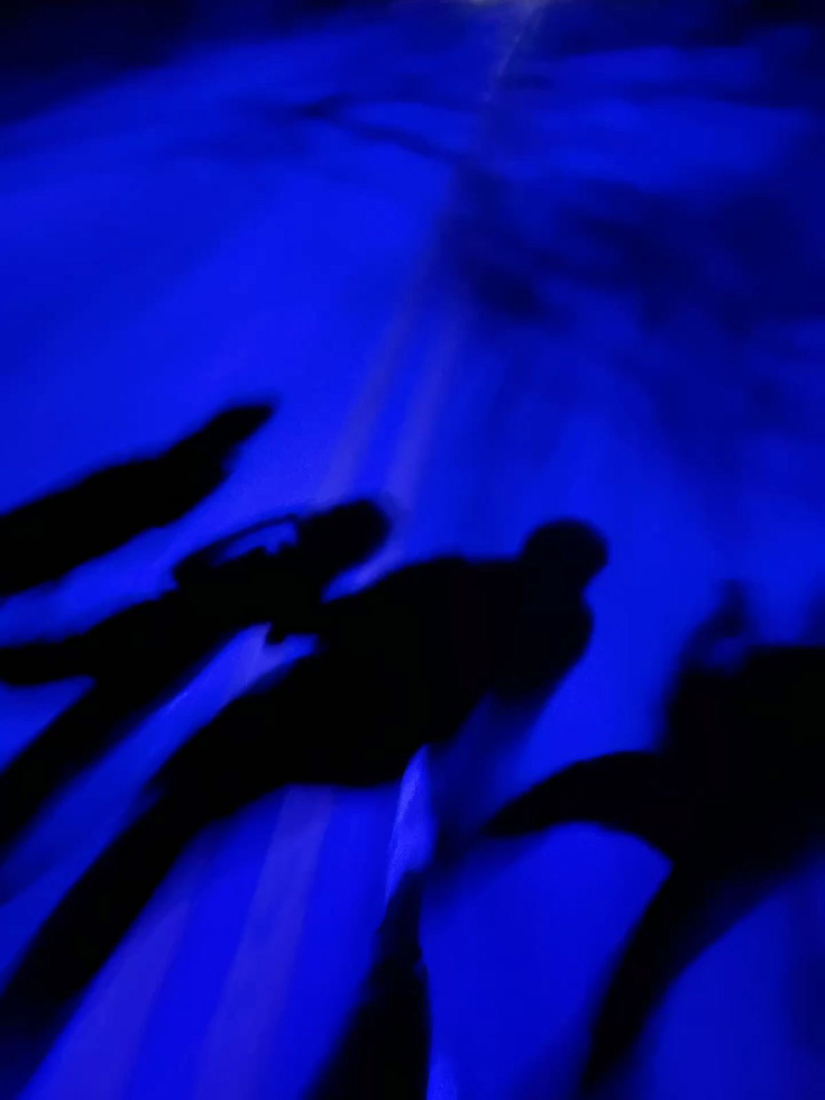
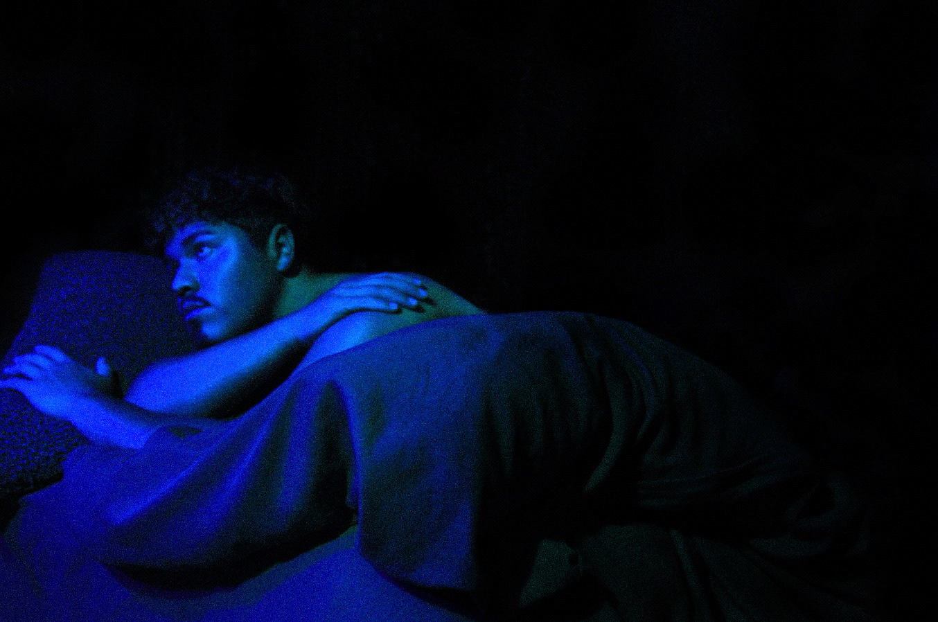
POTENTIAL IMAGES + PHOTOSHOOTS
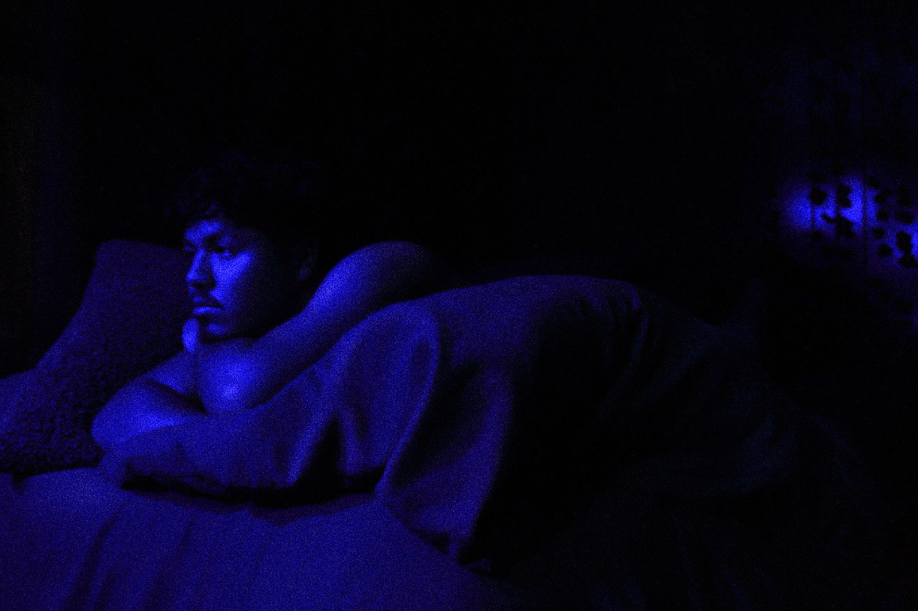
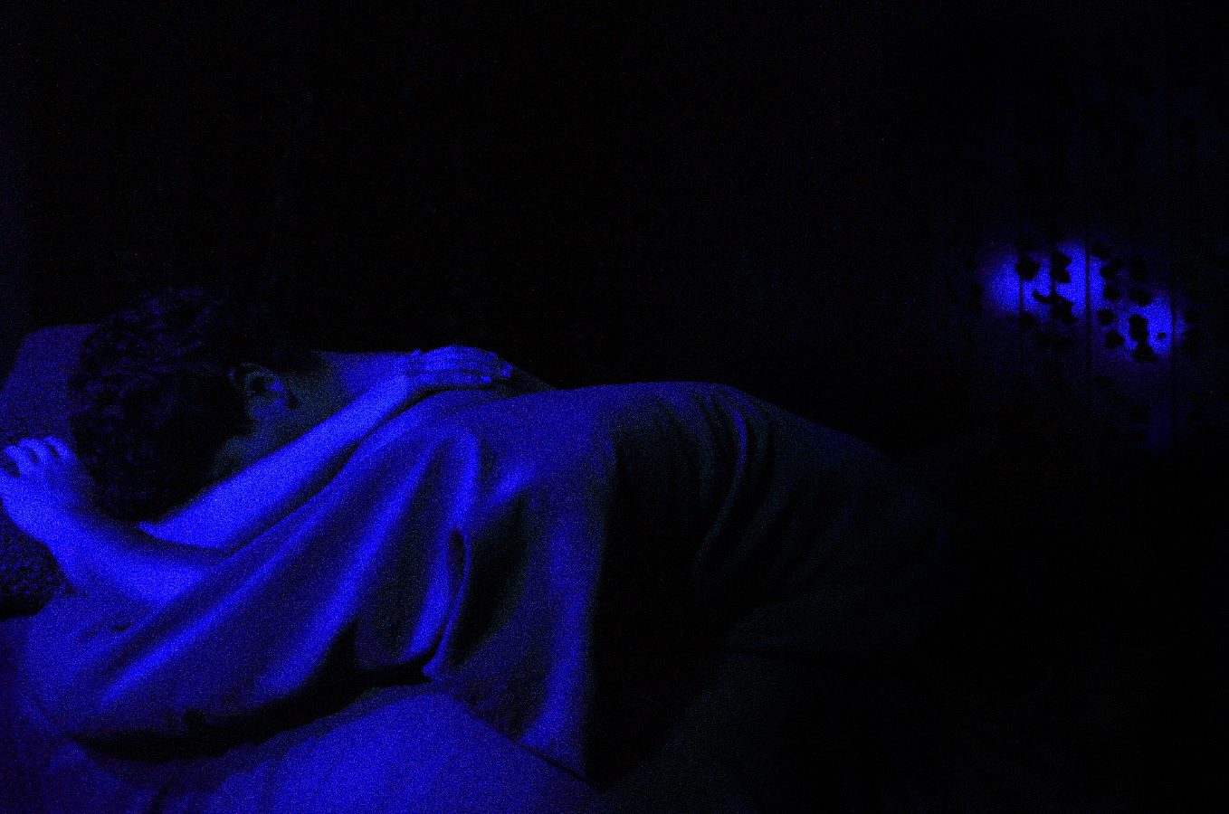
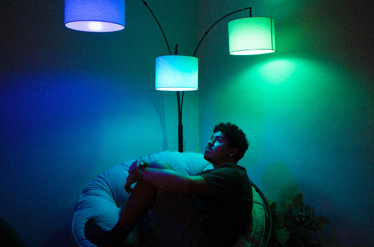
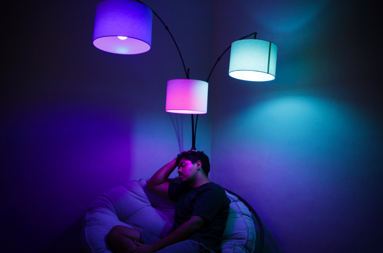
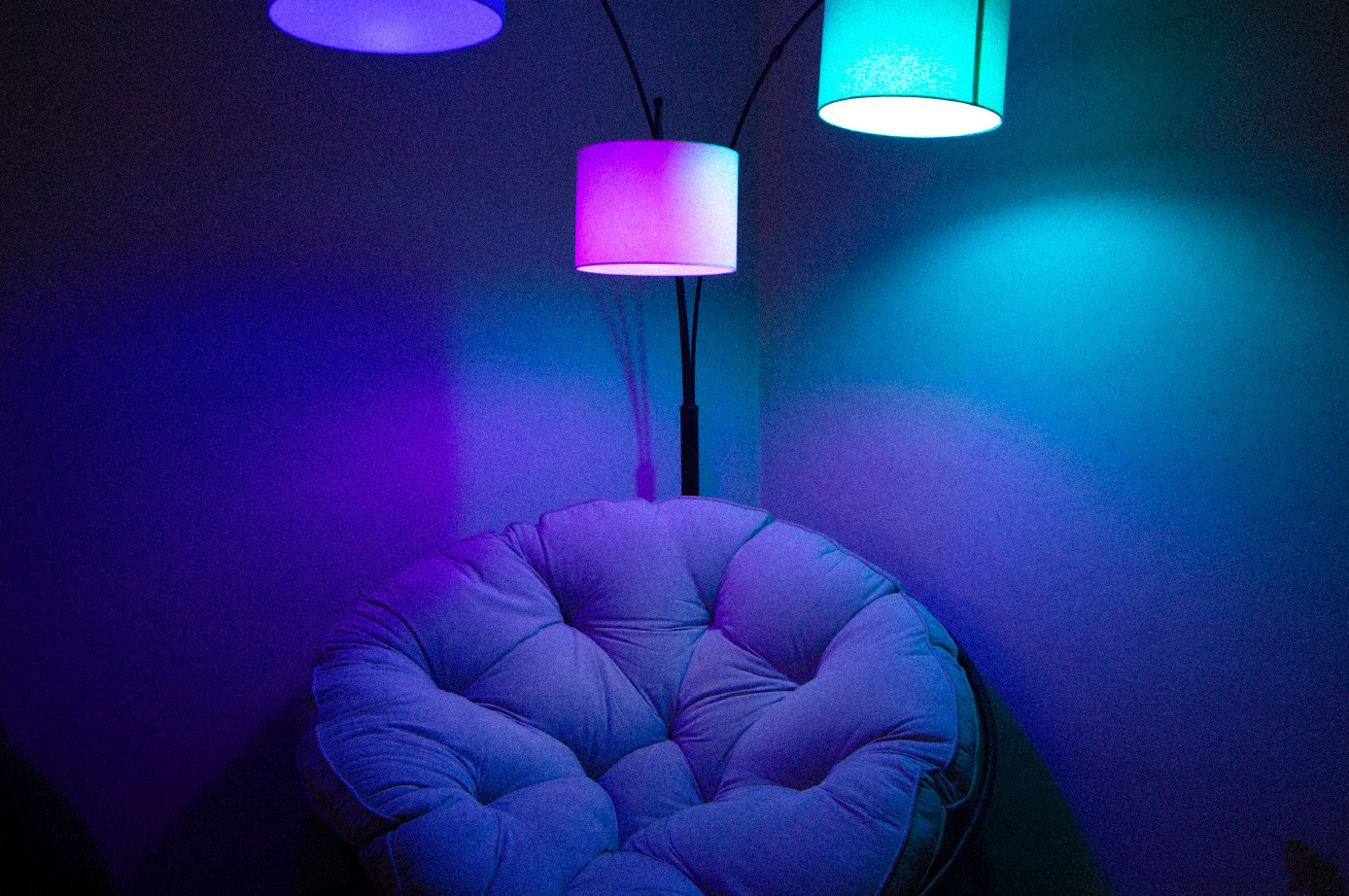
During the shooting process, I began replicating the deep blue color palette I was going for with a lamp in my bedroom and some color changing Govee lights. After the first photoshoot, I wanted to explore similar lighting but introducing more color variety and changing up composition.
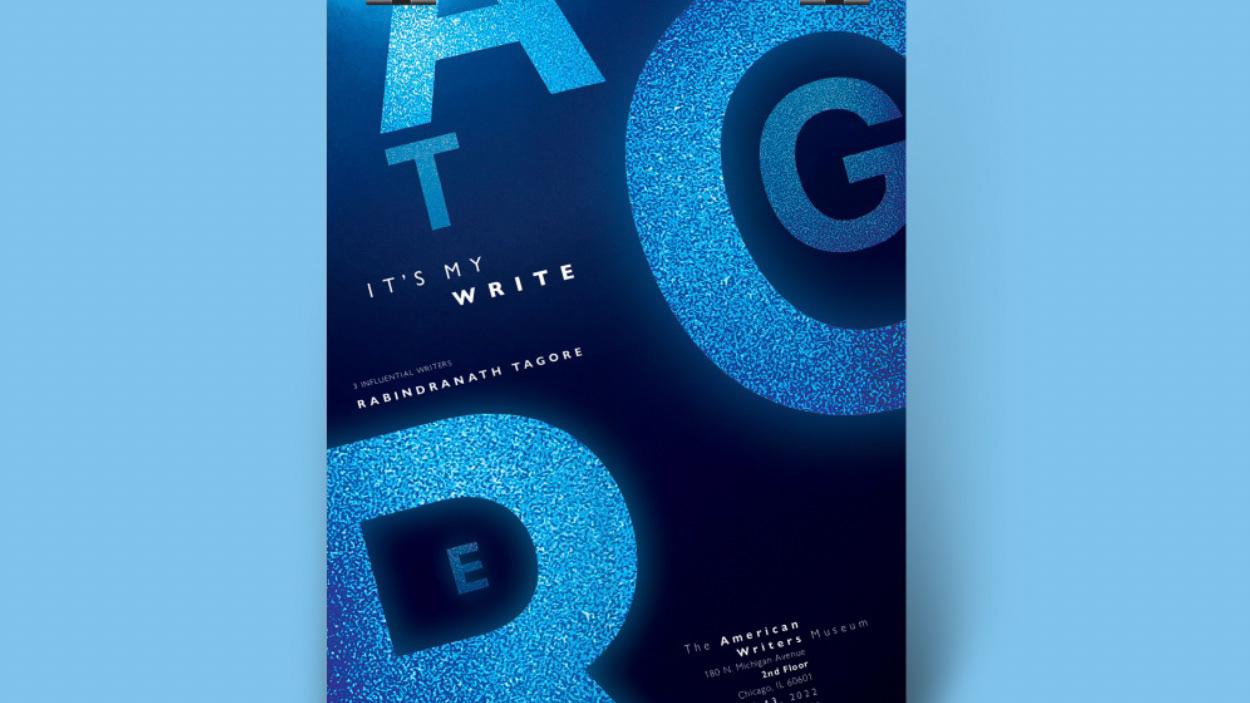
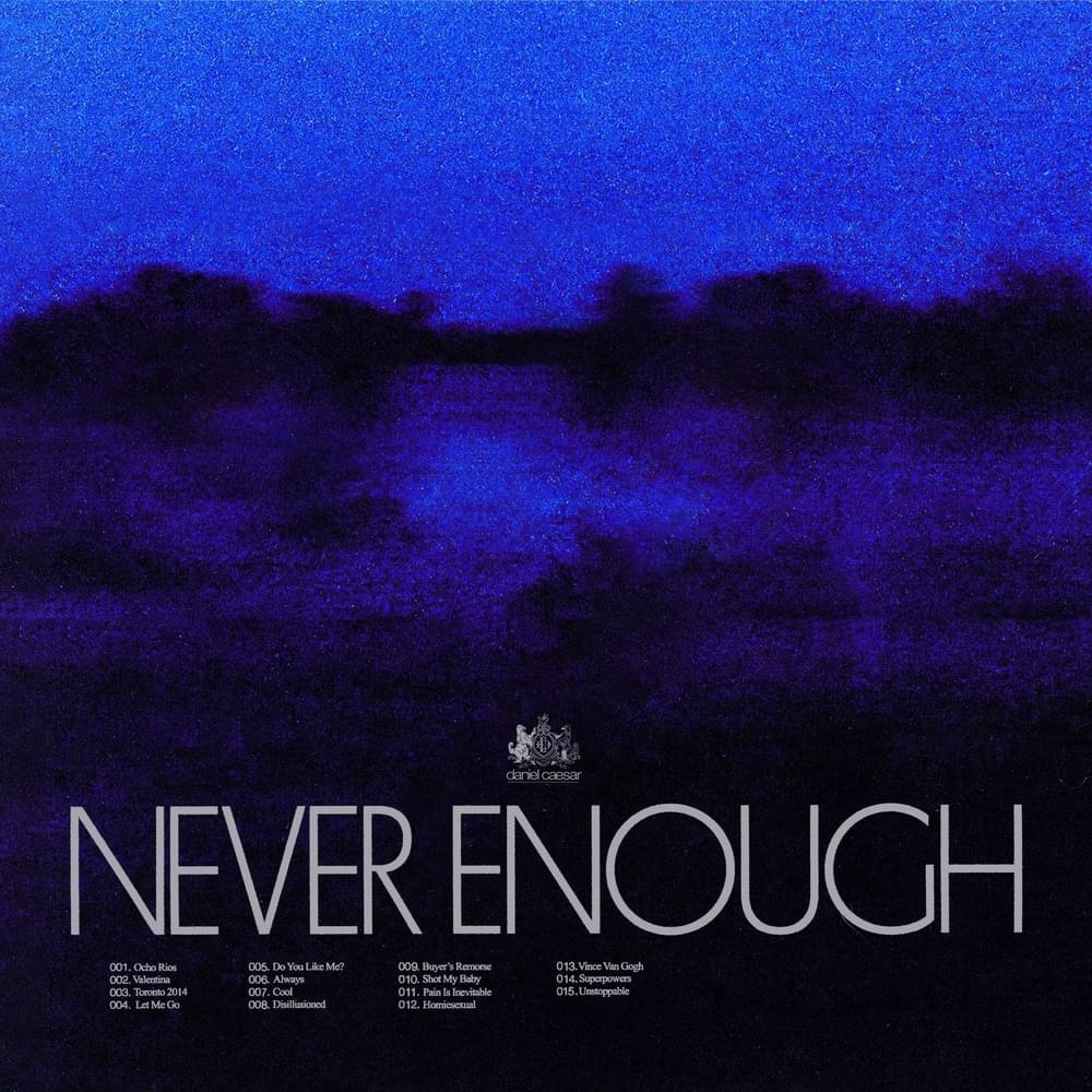
CHOOSING A TYPEFACE
When exploring which typeface I would use in my LP redesign, I wanted one that communicated the minimalistic, moody, and somewhat unwinding type of feeling I was aiming for. I immediately knew that I wanted to use a sans serif and one that had similar attributes to the one in the original design. Helvetica stood out to me as something uniform, low contrast, legible, and clean looking.
FINAL REDESIGN